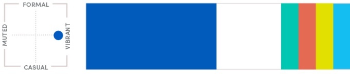
This chart represents a formal and vibrant tone and is a guide for understanding the color combinations within our communications.
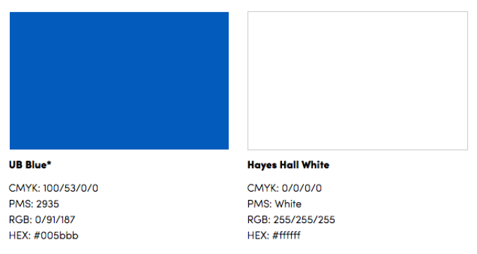
UB’s signature blue and white dates back to 1886, 40 years after the School of Medicine was established. At the time, the School of Medicine was tying its diplomas using white ribbons. As the School of Pharmacy prepared to graduate its first class, it looked to distinguish itself and used blue ribbons instead. As other departments came into existence and the student body increased, there came a need to create a university spirit insignia. The diploma ribbons were seized on as a distinctive color combination that didn’t conflict with those of other universities. Our blue and white have undergone many iterations over the last 130-plus years, but they endure to this day, representing the University at Buffalo at the highest level.
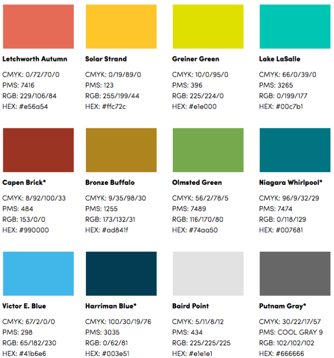
Although our color system is monochromatic, we understand that, in certain instances, other colors need to be used. For those circumstances, we have developed this set of secondary colors.
These colors should be used occasionally and sparingly. Under no circumstances should any of them become the predominant color for a school, center, institute or department.
Although we have a secondary color palette, our blue and white should be the predominant colors in most layouts. Never use secondary colors like primaries. Leading with our heritage colors celebrates the pride we have in our institution’s storied legacy and affords us the opportunity to incorporate a large amount of negative space.
Rather than viewing white space as a blank area, think of it as a pause. Whether it’s in a photo or a layout, don’t rush to fill negative space. What’s absent can focus attention on the content that’s there.
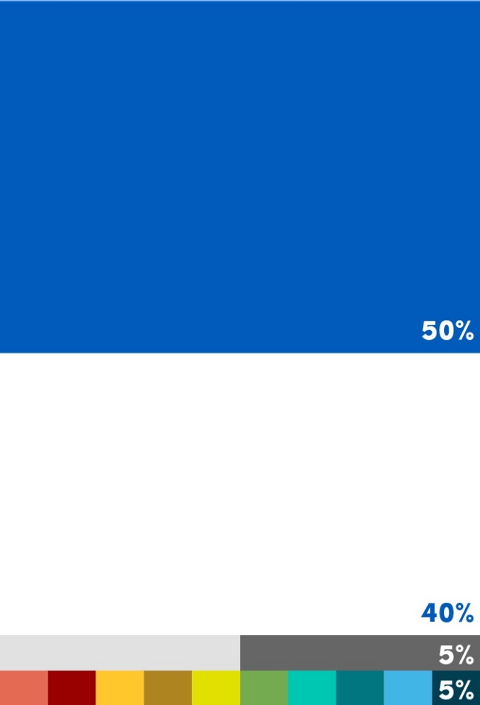
Use the ratios below as a guide for balancing UB Blue, negative space and the rest of the palette.